Monochrome logo. The evolution of famous brands. Modern monochrome logos -
Few people know, but the photo above is the real Apple logo.
Apple's main symbol has been updated several times already. The change of the logo is a kind of checkpoint, marking the transition to new views and principles of the company. Moreover, these changes were never random.
Do you remember the old company logos? Let's figure it out.
Newton logo (1976 - 1977)

The first Apple logo is far from a modern laconic symbol. By and large, he stood out in those days. The logo was created by one of the founders of Apple - Ronald Wayne, who quickly sold his stake in the company. The idea is cool - to use the replicated story about the discovery of gravity by Isaac Newton. But its implementation leaves much to be desired.
Minimalism? No, we haven't heard. The logo is more like a coat of arms: a shield, a heraldic ribbon, a grandiloquent signature. Absolutely not suitable for application to products, and all because of its bulky geometry and an abundance of small details. Fortunately, he did not last long.
Rainbow logo (1977 - 1998)

An ambitious company needs a recognizable symbol. That's why the founders of Apple turned to designer Rob Janoff of Regis McKenna. It was he who created the widely known bitten apple in iridescent colors.
In an interview, the designer said that he simply bought a bag of apples and experimented with them for a week. Many hoax fans like to attribute hidden meanings to this logo. But Rob Janoff debunked all the myths, according to him, he did not make any references to Alan Turing or to the Garden of Eden:
- stripes of all colors of the rainbow speak of the competitive advantage of Apple computers that could display a color image;
- the wrong order of these colors is justified by the fact that the leaf from the apple should be green;
- the fruit was “bitten” in order not to confuse the apple with other fruits;
- consonant “byte” (“byte”) and “bite” (“bite”) remain only curious coincidences.
Monochrome logo (1998 - present)

By the end of the nineties, Apple was on the brink of failure. After his return to the company, Steve Jobs made a stir - he closed unpromising projects, updated the staff and stopped renewing licenses for proprietary software. To permanently disown the failed old course, the logo was also changed. Since 1998 and until now - this is a one-color apple.
If the size of the previous logo rarely exceeded 1.5 x 1.5 cm, then the monochrome version is usually larger, brighter and more noticeable. Now the "apple" is drawn in three colors: black, white and gray. But before there were more varieties, here are the most famous:
iMac G3 Logo
The release of the iMac G3 in 1998 marked the return of Apple. Such a logo was put on stylish monoblocks, and it was the same color as part of the case. The PowerMac, Apple Studio Display, and iBook released a year later received similar logos.
Aqua logo

This logo first appeared on the PowerMac G4 Cube and was used for several more years in advertising and banners. Plus, it could be seen in early versions of OS X, because the logo fit perfectly into the concept of the Aqua interface.
"Glass" logo

Apple's desktop OS users first saw the logo in 2002 when they upgraded to OS X Panther. With the release of the iPhone in 2007, this symbol moved to mobile devices. It was replaced only in 2013 in connection with the release of iOS 7 and the rejection of skeuomorphism.
metal logo
Metal logos are one of Apple's favorite and recognizable features. Appearing in iMac G4 monoblocks, such logos wandered across all categories of Apple products. iPhone cases with holes? All for the sake of the cherished metal apple.
Logo “Product.RED”
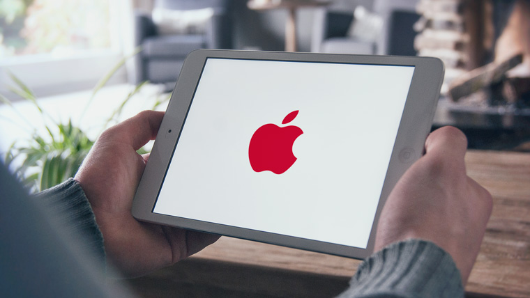
Apple is partnering with Product Red to help raise funds for the Global Fund to Fight AIDS, Tuberculosis and Malaria. On the official website of the company from Cupertino, you can find products, part of the proceeds from which go to this fund. Once a year, on December 1st, on World AIDS Day, Apple colors its logo red.
What's next?
Of course, Apple won't change the shape of its logo. You should not expect exotic color schemes from the company either, now minimalism is in vogue. Perhaps soon we will see the familiar logo made from new materials. Maybe
The first Apple logo was designed by Ron Wayne. This name says little, not only to the townsfolk, but even to geeks. Meanwhile, Ronald is the third co-founder of Apple, and also the biggest loser of the 20th century. He sold his 10 percent stake in the company for $800 just 11 days after registration. If not for this rash step, Ronald would now be one of the wealthiest people in the world with a fortune of $ 30 billion. Analysts say that the value of Apple will triple in three years, which means that Wayne may have lost about 100 billion simply by not believing in Apple.
The logo created by Ronald Wayne has nothing to do with the current one. It was a miniature work of art. In the center was the outstanding English scientist Isaac Newton, on whom an apple is about to fall (an insight!). In the future, the "Newton theme" will continue when Apple releases its PDA.
If you enlarge the logo, you will notice that along the border is the text: Newton… A Mind Forever Voyaging Through Strange Seas of Thought… Alone This is a line from William Wordsworth's autobiographical poem, The Prelude, which goes like this in its entirety:
And from my pillow, looking ahead by light
Of moon or favoring stars, I could behold
The antechapel where the statue stood
Of Newton with his prism and silent face,
The marble index of a mind for ever
Voyaging through strange seas of Thought, alone.
It looks like this in translation:
From my pillow, lit by the light
Moon and good stars, I could see
On the pedestal is a statue of Newton.
He is holding a prism. Quiet face
Like a mind dial that's alone
Floats through Thoughts strange seas.
 The logo turned out to be interesting (all these references to Newton, who really was alone, a touch of mystery, etc.), but not very suitable for the realities of modern business. Therefore, Wayne's work was used for about a year. Steve Jobs then turned to graphic designer Rob Janoff for help. It was required to create a simple, modern looking, well recognizable logo.
Rob completed this task in about a week. In an interview with the Revert to Saved blog, Yanov talked about how the logo was created. Rob bought some apples, put them in a bowl and began to draw, gradually removing unnecessary details. The famous “bite” was made on purpose: it was necessary to draw the logo so that it was strongly associated with apples, and not other fruits / vegetables / berries. The similarity of pronunciation byte / bite (byte / bite off) also played into the hands.
![]()
Rob Yanov made the logo in color, which gave good ground for speculation and myths. The most common, actively supported by Win users and Linux users, is that the Apple symbol reflects support for sexual minorities. This is not entirely true. Apple really supports the LGBT community, as evidenced by recent video, however, the color logo was created a year before gays began to use the rainbow as a symbol.
 The second myth is even more interesting. They say that an apple painted in the colors of the rainbow is a kind of sign of respect for Alan Turing. Turing is an outstanding English mathematician and cryptographer who made a feasible contribution to the fight against fascism. During World War II, he cracked the Kriegsmarine and Enigma ciphers, and after that he had a huge impact on computer science (Turing test, works on the theory of artificial intelligence). Turing's merit did not save him from criminal prosecution for homosexuality. Alan faced two years in prison if he did not agree to hormone therapy (which, among other things, led to breast growth and chemical castration). In addition, the most valuable thing was taken away from Turing: the opportunity to do what he loves - cryptography. As a result, Alan became a recluse, and then completely committed suicide. Moreover, the form of suicide was very unusual: Turing bit off an apple, which he had previously pumped with cyanide.
Rob Yanov debunks both myths. According to him, you should not look for a secret meaning. The color Apple logo was meant to reflect the fact that the company makes computers with color monitors. The poppy display at that time could display six colors. These colors were just indicated on the logo. There are also no regularities in the arrangement of flowers. Janov placed the colors in random order, with only green being placed first on purpose.
In this form, the logo lasted 22 years. In 1998, Steve Jobs, who had previously been expelled from Apple, returned to the company. Apple was in huge financial trouble at the time. Competitors sarcastically advised to close the shop and distribute money to shareholders. We needed drastic measures. And do you know what pulled Apple out of the crisis? Industrial designer Jonathan Ive has come up with a new case for the iMac G3.

![]() Computers that look like lollipops literally saved Apple. Moreover, they have become iconic - their images flashed in films, TV shows, glossy magazines. It is clear that a motley logo on a colored poppy would look silly. Apple has moved away from using a color logo. So since 1998 we have seen a laconic monochrome logo. The company has matured. And we are with her.
Computers that look like lollipops literally saved Apple. Moreover, they have become iconic - their images flashed in films, TV shows, glossy magazines. It is clear that a motley logo on a colored poppy would look silly. Apple has moved away from using a color logo. So since 1998 we have seen a laconic monochrome logo. The company has matured. And we are with her.
Rob Yanov created an outstanding logo. This is not a banal insignia, but a real Symbol. But Yanov's merits were not somehow particularly noted by Apple. At the beginning of the post, I mentioned the Nike logo. It was created by Carolyn Davidson, a student and freelancer from Oregon. Nike, at the time a young company, paid $35 for the work. But ten years later, the founder of the company, Phillip Knight, gave her an expensive ring with a diamond "stroke" - corporate identity, as well as an envelope with company shares. Knight appreciated the designer's work, making her co-owner of Nike (albeit with a small package).
Reflections on the visual simplification of graphic design by ADN Digital studio.
To bookmarks
This is us and our belated, but no less cool analytics. Today we will talk about a hot topic - visual simplification of graphic design.
Simply put, it is the very case when the external attributes of a modern logo are present (simplicity, functionality, aesthetics), but the meaning was not reported.
Here are some more examples for comparison. Three popular taxi ordering services in Russia and their icons:
Let's analyze all three signs according to our already proven scale "aesthetics and content":
Aesthetics
The first two signs are minimalism, geometry, clear forms. The third one is the silhouette of a person with many small details (hair on the head, shirt collar). Outwardly, the Yandex.Taxi and Uber icons win. In addition, "Yandex" furnishes everyone here - the company recently rebranded, changing the geotag icon to what you see above.
At the same time, the coloring of the cars has also changed - now they have the same geometric pattern as the icon. This creates a far greater connection than simply putting a company logo on a car.
Meaning
At "Yandex": the traditional color scheme of a taxi is used - yellow and black. The rectangles are assembled into the letter "T" (that is, "taxi"), a very good find.
At Uber: the sign symbolizes a car with a built route. The circle is the search area on the map in the app.
In Gett, the man with his hand raised is a classic roadside "voting" gesture (although the pose is more like "now I'll get you the moon from the sky, dear"). Perhaps, with spread fingers, the brand wanted to say that “we have everything on the top five,” but this is not accurate.
Summary
Yandex has the coolest semantic content, visual - Yandex and Uber. We personally are of the opinion that Yandex.Taxi outperformed everyone in terms of branding. At least for today.
Okay, enough already, let's wrap up.
If you are going to order a logo, then know that this is the same system as, for example, a website. And it obeys roughly the same laws. In addition, design trends in identity development generally coincide with those in web design.
In order not to be a “client from hell” and make value judgments on emotions alone, use the coordinate system that we have given in this article (“aesthetics-meaning”). If there is a bias in one direction, and the second one clearly sags, criticize with reason.
In general, be smart, and you will never be sold a blue diamond, a red circle, or a yellow sausage. Unless, of course, you are in the business of producing blue boxes, red balloons, or yellow sausages. So it goes.
WriteThe logo is a tool for the recognition of the services and goods of the company by the public. In other words, it is part of the branding of the company. Without such recognition, people will not be able to differentiate between companies and therefore will not expect certain standards from the companies they interact with. If the logo is designed effectively, it can subconsciously communicate the organization's unique selling proposition to the consumer. To evaluate the effectiveness of logos, it is best to examine the history of their development over the years. In this article, you will be able to see how the logos of some of the most famous companies in the world have evolved over the years, decades and even centuries. We hope this gives you a chance to see how companies have been able to design their logos and make them recognizable.
Volkswagen
In the early 1930s, the design office of Ferdinand Porsche in Stuttgart developed several prototypes of small cars with 4-cylinder engines from Zundapp and NSU. In 1934, Adolf Hitler commissioned Porsche to mass-produce such machines. He decided to give the German people a mass and cheap model, which he called "Volkswagen" (Volkswagen, abbreviated as VW), that is, "People's Car". After Germany was defeated in World War II, the factory was taken over by the British. The logo has been significantly changed.

Today, the Volkswagen logo has blue and gray colors.

Nike
In 1971, company founder Phil Knight met graphic student Carolyn Davidson and asked her to design a logo for a shoe. He explained to the designer that he needed a dynamic logo. She created several versions of the logo and collaborated with the company on catalogues, booklets, emblems and other products. Carolyn Davidson worked for Nike for 29 years. Tracing the evolution of the Nike logo, you can see that initially it was a combined sign, in which a graphic element was combined with text. In the first variant, the direction of the text is the same as the graphic element, however, in the subsequent variants, the text is strictly horizontal, which gives greater contrast. In the final version, the logo became purely graphic and as concise as possible. On the one hand, in this form it is more expressive, but, on the other hand, it can be assumed that by this time the name of the company had already turned into a brand, and the need to indicate it on the logo was no longer necessary.

Today the Nike logo looks like this:

Mozilla Firefox
The original logo featured a Phoenix with its wings spread out to match the original name: Phoenix.
Later, for legal reasons, the name was changed, retaining the image of a fiery bird - firebird. Icons at that time looked like this:

But this name was also abandoned. It has been changed to Firefox. The most interesting thing is that firefox is not a fox, but a red panda. The first logo prototype, created by British graphic artist John Hicks, looked like a panda.
Later, the globe was added to the logo as a symbol of the Internet, and the panda was made a bit like a fox. The logo looked so unique that a text signature was immediately abandoned during its development.
Pepsi
As one of the oldest companies, it has changed more than one logo in its history. But the red color can be traced in every logo. And only since the 50s, 2 other official colors have been added: blue and white.

Now the logo of this company looks like this.

Microsoft
In 1975, the year the company was founded, its name was "Micro-soft". That's right, with a hyphen, which was later removed, they created a logo with disco-style typography, which was so beloved at that time.
After 7 years, disco went out of fashion, including in design, and Microsoft introduced a new logo with a central letter O in the form of a stylized eye. The company's employees nicknamed it Blibbet and loved it so much that when the logo was changed in 1987, one of the employees organized the "Save Blibbet" campaign. They did not return the eye, but made small concessions - they began to make Blibbet Burgers in the cafeteria for employees. The logo of the 1987 version was in fact the same thing that we see now.

In the fall of 2012, a new Microsoft logo was released. It includes the colorful symbol that everyone is used to seeing on the company's Windows products. Microsoft spokesman Jeff Hansen told the Seattle Times that the logo "represents not only our past, but also our future - newness and freshness."

Siemens
The logo of this company used to be a combination of two Latin letters S and H, according to the first letters of their creators Siemens and Halske. And in 1973, it was decided to simply call the company Siemens AG.

The logo currently looks like this:
![]()
Xerox
Their very first logo is considered by many to be the best - it lasted 43 years. Then he lost his protrusions and turned red. According to the President of Xerox, the new energetic logo emphasizes the brand's modern style, less formal and more lively, in line with "business today." It has preserved the history of the company and has great prospects for the future.

Apple
The first logo was designed by Ron Wayne, one of the three founders of Apple, along with Steve Jobs and Steve Wozniak. The logo at that time depicted Isaac Newton sitting under an apple tree, symbolizing insight and lines from William Wordsworth's poem: "Newton ... A mind forever voyaging through strange seas of thought ... alone." Soon, Steve Jobs decided to abandon the Newton logo, as he believed that it was too complex and difficult to reproduce at small sizes on various surfaces. In 1977 a different colored apple logo was chosen. Largely thanks to this bright, memorable and fashionable logo at that time, the company was able to reach a new level and increase sales. The monochrome logo replaced the famous rainbow logo in 1999. Almost simultaneously with the monochrome logo, there was also a glass one. The official one today is the chrome logo, developed in 2007. The Apple logo is one of the most iconic, recognizable and expensive logos in the world, so it's no surprise that it hasn't changed radically since 1977.

Chrome logo

bmw
The company was formed as a result of the merger of two small manufacturers of aircraft engines - Rapp-Flugmotoren Werke and Otto Werke. The nature of her activities is captured in the logo - a rotating aircraft propeller against the blue sky. The company logo hasn't changed much.

Today the logo looks like this:

Coca Cola
For the second century in a row, the world famous Coca-Cola drink has been one of the most recognizable brands. The name itself, the Coca-cola logo, the unique font of the trademark - all this was invented by Frank Robinson, not even knowing at that time about the future of his discovery. In 1980, a new spelling was introduced, but such a logo was completely unsuccessful and the company quickly abandoned this idea. Today, the Coca-Cola logo looks almost the same as it did a hundred years ago, with the exception of the “reverse”, which the logo lost in 2008. Now the name of the drink appears in red letters on a white background.


LG
The LG empire began its history during the Second World War in South Korea. It all started with the production of tooth powder. Initially, these were two separate organizations: the cosmetics company Lucky Chemical Industrial (since 1947) and the GoldStar radio-electronic factory (since 1958). After the merger, the company received the name Lucky Goldstar, and in 1995 changed it to LG Electronics. Today, LG is a huge South Korean conglomerate that includes such companies as LG Chemicals, LG Telecom, and even the LG Twins baseball team. All of them are united by a common slogan "Life is Good" ("Life is good!").


Mazda
The first Mazda logo appeared in 1934, shortly after the launch of the MazdaGo three-wheeled trucks. The name Mazda was chosen by the name of the supreme deity of the ancient Iranians. The first in the long history of Mazda stylization of the key letter for the company - M. The curved curve also refers us to the emblem of Hiroshima - the hometown of Mazda Motor Manufacturer. The lines diverging in different directions resemble a two-lane highway. In 1991, for only two years, a logo was designed for Mazda cars. This Mazda logo was associated with wings, the sun and a circle of light. And finally, in June 1997, the logo was introduced, by which even today we recognize Mazda cars.


According to materials:
Our Vkontakte community has a section #logomachine_help, in which we talk about the most common design mistakes and show how they can be fixed. In this issue, we have grouped errors into several groups to show what not to do with logos using their example.
Color sticking
The first common mistake is the so-called "color sticking". The easiest way to check if there is a problem with color or contrast is to convert the logo to monochrome. When using this method, problem areas where the form merges with the background will be immediately visible.1.SledHelp
The following logo was sent to us in public: 
If the logo is converted to black and white, you can see its problem - the background color and the color of the husky are very close in tone: 
Because of this, the forms merge, the composition turns into a mess: 
The problem is quite serious - if you need to use a monochrome version of the sign, the logo will lose its shape and will be poorly readable.
But there is good news - the problem is easy to fix. It is enough to increase the contrast between the elements and it is solved - the husky is readable in any color. Testing for monochrome again: 
Now at any distance you can understand that this is a husky. But our advice: it is worth finalizing the logo and thinking over the elements of corporate identity.
2. Visa with love
Every Thursday in the public we hold live broadcasts and discuss the logos of those who send them for analysis. This logo is from the stream: 
There are a lot of light spots in the texture pattern, because of which it merges with the plane. This is clearly seen if the logo is converted to monochrome - the plane is almost lost against the background of a light texture: 
To fix this, let's select another drawing and position it correctly - we'll make sure that details that are close in tone do not touch each other, as in the initial version: 
Now in the monochrome version, you can see that the texture does not merge with the background, and the element in the center does not lose its shape: 
3. Russian Tradition
In this logo, sticking is both in the sign and in the font part. Let's convert the logo to monochrome to understand how it reads when the color changes: 
The logo is made in the "low poly" technique, but there are many obvious errors in the execution: all triangles are painted in a random color, without taking into account light and shadow. The grid is built poorly - because of this, the bear is not recognizable and rather looks like a Triceratops swollen with fat.
The star symbol is used in the font part, but it is recognized with great difficulty. One could turn a blind eye to this if the star did not interfere with reading the title: 
Correcting the logo: we select real “bearish” colors for it - shades of brown and beige. We leave the old grid, we do this in order to show that it is more important to work correctly with color, light and shadows.
We remove the star from the text - it is superfluous here, gives strange associations and makes it difficult to read the title: 
Converting to monochrome: 
Because of the right contrast, the bear remains a bear even if the colors fade. The text is now readable without problems.
Sticking in shape
These were examples of sticky colors. There is also such a situation: the elements do not touch each other correctly, because of which the shape is lost and the readability of the logo deteriorates. This is what "sticking in shape" means.1. Kit-cat
But, since we give express advice, let's go the easy way: make a whale, but with cat ears and whiskers. The idea is not complicated, but it is also easy to read, even if you do not see or know the name of the company: 
The form is readable, corresponds to the name - and no random lines.
2. Cloud.rf
The Cloud.rf logo has a similar problem - there are a lot of elements, very little distance, all this gives not very pleasant associations and makes you feel like a trypophobe (just don't google what it is): 
Blur testing helps to understand how the logo is perceived on the fly. There is not always time to consider a sign, so it must be in a form that is easy to recognize and remember.
Cloud.rf did not pass the blur test - the shape turned into something incomprehensible, the name is impossible to read: 
Correction: we make the shape of the cloud classical, understandable at first sight. Inside the cloud, we remove unnecessary elements, give more air to the logo and immediately test for blurring: 
Now the unpleasant associations are gone, and the cloud remains a cloud, the elements inside do not turn the whole form into something incomprehensibly unpleasant.
3. Aviator
And again - too many elements! Why so many details? If the logo is reduced - for example, imagine that the logo will be a favicon (website icon in the browser tab), it becomes generally unclear what is happening: 
Sometimes extra elements just need to be let go. We removed all the small details: the lines between the wings, two circles, an asterisk. 
The remaining lines were thickened and the font was chosen without flirting with the old days, it turned out like this: 
After the changes, the shape of the aircraft is no longer lost, and the name is easy to read.
4. Pineapple
The creative studio Pineapple sent us its logo for the live broadcast. At a small size, the element in the center of the logo turns into a shapeless spot. It is impossible to read what is written under the title: 
There are many small forms and a huge, no, HUGE number of colors in the sign. There is little air here, poor contrast and overlay of elements on top of each other: 
The ideal solution would be to completely redo the sign, but you can try to simplify this one as well.
We say goodbye to unnecessary details that add nothing to the logo. We remove the sign from the font and put it next to the name, make it not so colorful, test it for size: 
Now the logo has become more harmonious, the shapes are recognizable - it can be used in both large and small formats.
Extra elements
The next common problem in logo design is extra elements. Often people try to put all the information about the company in the logo. What this leads to, let's look at an example.1. Gotti
Logo sent to the stream: 
What is Frankenstein? Everything is here: the name, the website, the slogan in one logo. Why such violence?
No need to try to put all the information about the company in the logo. We make cosmetic repairs: 
It would be better if you leave the name and, for example, one interesting detail - the letter "G" in the corner.
Now the logo is easy to use on any surface or medium, and all additional information can always be indicated next to it.
Poor readability
Without readability, there will be no recognition. Related to this is the following error in logo design.1. Lative and Muse Room
These logos were sent to us in #logomachine_help and shown on the stream. Here the same problem - it is very difficult to read the name of the companies. 
In the case of Lative, it's enough to make the first letter look more like an "L". No flirting is needed, they do not help the sign in any way and do not add anything: 
It is important that the name is read easily and clearly - otherwise how can you later remember what the company was called if you don’t read the name?
Muse's room - the technique of negative space is incorrectly used. You need to add more dark spots and calm the inscription - make the letters the same. 
Now there is no doubt that the Muse's Room is just a little room, and not something else.
As a result:
- It is important to check whether the logo does not lose readability when converted to monochrome, blurred or reduced;
- It is necessary to remember and know where, in what size and on what background, the logo will be used;
- It must be remembered that the logo must remain a logo. It should not contain the website address, slogan, hashtags or other information that is not an integral part of it. Like a descriptor.
Don't forget to share these simple tips on social media. And, as always, good luck to you and your projects!
Prepared by Victoria Slepchevich for Logomachine