Basics of composition in photography. Frame construction photography lesson Correct photography composition
10 simple rules for creating a composition in a frame.
1. Contrast

How to attract the viewer's attention to your photo? There should be contrast in the frame:
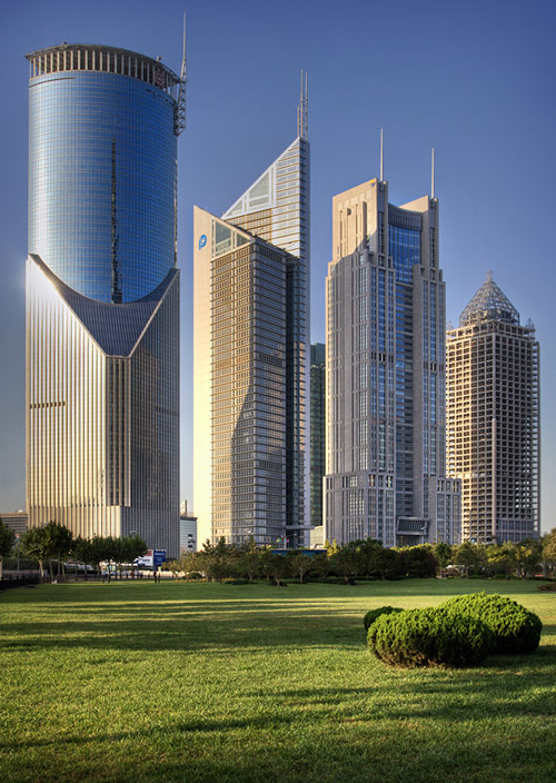
- A lighter object is photographed against a dark background, and a dark object against a light one.
- Do not photograph people against a yellow or brown background, the color of the photo will be unnatural.
- Don’t shoot people against a colorful background; such a background distracts the viewer’s attention from the model.
2. Accommodation

Important plot elements should not be placed randomly. It is better that they form simple geometric shapes.
3. Balance

Objects located in different parts of the frame must match each other in volume, size and tone.
4. Golden ratio

The golden ratio was known back in ancient Egypt, its properties were studied by Euclid and Leonardo da Vinci. The simplest description of the golden ratio: the best point to position the subject is approximately 1/3 of the horizontal or vertical border of the frame. The placement of important objects at these visual points looks natural and attracts the viewer's attention.
5. Diagonals

One of the most effective compositional patterns is the diagonal composition.
Its essence is very simple: we place the main objects of the frame along the diagonal of the frame. For example, from the top left corner of the frame to the bottom right.
This technique is good because such a composition continuously leads the viewer’s eye through the entire photograph.
6. Format
If the frame is dominated by vertical objects, shoot vertical frames. If you photograph a landscape, shoot horizontal frames.
7. Shooting point

The choice of shooting point directly affects the emotional perception of the photo. Let's remember a few simple rules:
- For a portrait, the best point is at eye level.
- For a full-length portrait - at waist level.
- Try to frame the frame so that the horizon line does not divide the photo in half. Otherwise, it will be difficult for the viewer to focus on the objects in the frame.
- Keep your camera level with your subject or you risk skewed proportions. An object taken from above appears smaller than it actually is. So, when photographing a person from the top point, you will get a short person in the photograph. When photographing children or animals, get down to their eye level.
8. Direction

When building a composition, always take this point into account.
9. Color spot

If there is a spot of color in one part of the frame, then there should be something in another that will attract the viewer's attention. This could be a different spot of color or, for example, an action in the frame.
10. Movement in the frame

When photographing a moving subject (car, cyclist), always leave some space in front of the subject. Simply put, position the subject as if it had just “entered” the frame, rather than “exiting” it.
Publication date: 22.07.2016
This is a continuation of the article, you can find the first six methods. Let us remind you that our material does not pretend to be a comprehensive work on photographic composition. We simply give a number of practical tips that can inspire new photographic experiments.
7. Accents
In order for the viewer to understand the essence of your frame, you need to place the accents correctly. What will help emphasize the main point? Sharpness, brightness, color, size, shape, placement in the frame... There are many options, and there is no point in memorizing them - to correctly place accents, you only need experience in building a composition. Of course, first you need to decide on the plot of the frame, the main characters and details.
The setting sun breaks through the mountain peaks. Thanks to the haze, we see the rays clearly. One of them, like a theatrical spotlight, illuminates the side of the ship. Agree, without the ship this shot would have been more boring. The main object is highlighted with color and brightness. In addition, the guiding lines of the rays “point” to it. During the shooting, I didn’t think about all this, but simply shot as experience told me.
It’s worth learning how to work with accents from Elliott Erwitt, available on Prophotos.

8. Framing
I would like to illustrate this point with photographs by the famous street photographer Alexander Petrosyan - “Peter Inside” and “Window to Petersburg”. By the way, the author shares the history of their creation in articles published in our magazine.


Essentially, framing is creating a multi-dimensional composition. It’s just that in this case the foreground “frames” the rest of the plot. What can become the foreground? A window, curved branches, a gap in the greenery of trees, etc. With the help of framing, you seem to deepen the plot of the photo, showing the plot from an unusual side. Thus, in the photographs of Alexander Petrosyan, famous tourist places of St. Petersburg are presented in an original way. It turns out that St. Petersburg is not only the gold of the domes and the grandeur of the Peter and Paul Fortress, but also, so to speak, the prose of life. Framing can effectively complement your plot. Here I used a "frame" of foliage that created an unusual pattern around the main subject.

9. Shadows and silhouettes

Sometimes the shadow and silhouette of an object look more expressive than the object itself. This simple truth is known and used not only by photographers, but also by designers, artists, and directors. Just remember the shadow theater. For silhouettes to be expressive, they must be recognizable and readable. A simple example: if you photograph a person squatting, his silhouette will most likely resemble a potato. But if you shoot a standing person, his arms and legs will be visible - the viewer will immediately understand that there is a person in the frame.


Of course, to create such a photo you need to find a dimly lit object against a bright background. Fortunately, this happens often in nature.


Shadows can also become the main characters of your photo. Notice how they lie on surrounding objects, change their length and shape depending on the time of day. Perhaps shadows are the few things that can be captured well on a bright sunny day, when there is very harsh lighting all around.
10. Rhythm
Just as we love rhythmic music, we also love “rhythmic” shots.

Nikon D810 / Nikon AF-S 18-35mm f/3.5-4.5G ED Nikkor
More often, rhythm is formed from repeating objects moving horizontally in the frame, and is perceived from left to right - in the same direction in which we read the text. Rhythm can be created by pillars, steps, trees, waves, architectural elements (columns, for example) and even color spots. The photographer’s task is to find a “rhythmic” picture and show it in the photo.
Like many other techniques, rhythm can act as the object and main idea of the photo, or it can only emphasize the plot.

An example of an artificially created rhythm. This photo is the result of working with multiple exposures. To create it, you don’t need photo editors; a camera that supports this function is enough. For example, Nikon D7200, Nikon D500, Nikon D750, Nikon D810.
Read more about this in this.

Sometimes a rhythm disturbance looks impressive. Simply place an “extra” object into a repeating rhythmic pattern. This will create an emphasis on the “offender object.”
By the way, there are quite a lot of photographs with rhythm in this article (try to find them all!), because it can easily be used in combination with other artistic techniques. It’s interesting to talk about rhythm, but it’s even more interesting to look for it in the world around us.
11. Dynamics
Conveying a sense of movement in a still photograph is a difficult task that can be solved in many ways. For example, by disturbing the balance in the composition.

Conveying movement in a photo is the topic of, if not an entire book, then certainly several articles. In this material we will describe only the most basic.
It is worth introducing the reader to two concepts: static and dynamic composition.


Try experimenting with unstable, dynamic compositions. Sometimes even initially static plots can be beneficially filled with movement.

However, sometimes an unstable composition hurts your photo. It is important to remember that plots can be both dynamic and static. For example, a pastoral landscape is likely to be static and would benefit from a stable, balanced layout.

Often, according to the plot of a shot, it is necessary to show not movement, but balance, calmness.
A simple example of “inappropriate dynamics” is a littered horizon in a landscape photograph. And a photograph of a runner may require a dynamic composition.
Here are some tips for creating dynamic photos:
- A tilt of the horizon line is acceptable when creating the effect of movement in a photo. If you tilt the horizon in the direction your character is moving, you will visually speed him up.
- Lines indicating the direction of movement will emphasize it. Lines directed perpendicular to it will “slow down”.
- Leave more space in the direction of your hero's movement.
- Movement in the frame should be directed from left to right. We read in this direction, which means it is easier for us to perceive movement in the same direction.
- When photographing people and animals, catch the key phase of movement. To do this, use continuous shooting. The higher its speed, the greater the chances of catching the right moment. Therefore, in cameras designed for reporting, continuous shooting is usually very fast. Thus, in the new Nikon D500 model, shooting is carried out at a speed of 10 frames per second, and in the full-frame Nikon D750 - 6.5 frames per second.
How do photography masters work with movement? First of all, they trust not the rules, but their own compositional experience.
If, when shooting movement, you get blurry or dark shots, then you should “pump up” your technical shooting skills. You can start with this article, it describes typical beginner mistakes and methods for eliminating them.
141991 Photography from scratch 0
In this lesson you will learn: Basics of composition. Semantic and decorative layout of the frame. Compositional techniques: perspective, rule of thirds, golden ratio, diagonals. Main and secondary objects of the composition. The main mistakes of beginning photographers.
What is composition? Composition (from Latin compositio) means composition, connection, combination of various parts into a single whole in accordance with some idea. This refers to the thoughtful construction of an image, finding the relationship of its individual parts (components), which ultimately form a single whole - a complete and complete image.
Why is proper composition important? In order to better convey an idea in photography, special expressive means are used: lighting, tonality, color, point and moment of shooting, plan, angle, as well as pictorial and various contrasts. Reflection of living, real life will not be adequate without following certain rules. How, for example, to convey movement or the fleetingness of a moment? This requires knowledge of the laws of composition, otherwise your photos will turn into random shutter clicks and will not be interesting to others.
The general meaning of a correctly constructed frame composition is that we look at the photograph easily and naturally. At the same time, we receive aesthetic pleasure, see the logical connection between objects in the frame, and admire the details of the image. It happens the other way around, we are surprised or shocked, everything is incomprehensible to us, but even in this case, the correct - or deliberately incorrect - composition conveys the author’s creative intent through the photograph.
Plot center and balance
Any good photograph should have a main subject, sometimes called semantic or plot center. This is what the author climbed mountains for, crossed deserts, or simply took time away from having fun with friends to take out the camera and press the button. This center can be “I’m at the barbecue,” or it can be a snow-capped peak, a lonely tree, a human face, or just a graceful curve of lines in an abstract still life.
In simple home photographs, the subject and geometric center often coincide, that is, the main subject is directly in the center of the photo. Family albums are filled with such cards, and only the closest relatives are interested in leafing through them, much less looking at photographs. If a photographer strives to take something more than a “me against the backdrop of the pyramids” shot, then one must be prepared for the fact that more time and effort will have to be spent.
Before you press the camera shutter button, decide semantic center and find it in the surrounding space, mentally highlight what is the main thing, the most interesting for you. Perhaps at first it will not be easy and you will have to work with your head (well, turn in different directions, look around), but then, as you gain experience, your eye will find interesting subjects on its own.
 Let's move on. There is a very old and simple rule that allows you to almost always achieve success. Sometimes it is called rule of thirds. It allows you to harmoniously balance the image, giving it dynamics and visual naturalness. What is its meaning? The frame space is mentally divided into equal parts by two horizontal and two vertical lines. Three horizontal and three vertical stripes make up a kind of grid with points of intersection of lines.
 It is recommended to place the most important elements of the frame along these lines or at their intersection points. The fact is that such an asymmetry of the image is perceived more naturally and in many cases makes it possible to effectively use the negative space around the main subject.
 The rule of thirds is widely used in many different types of images. For example, in landscapes, the horizon line is often placed along the upper or lower third line, and next to one of the vertical lines is an object to which they want to draw attention (a tree, a building, etc.).
 When creating portraits, the face can be moved away from the center to avoid unnecessary resemblance to a “passport photo.” To draw attention to the eyes, it is worth choosing a composition so that one eye is located at one of the upper intersections of the conventional lines.
 For many centuries, to build harmonious compositions, artists have also used the concept "Golden section". A concept close to the rule of thirds. It has been discovered that certain points in a painting composition automatically attract the viewer's attention. There are only four such points, and they are located at a distance of 3/8 and 5/8 from the corresponding edges of the plane. Having drawn the grid, we received these points at the intersections of the lines.
$IMAGE8-left $A person always focuses his attention on these points, regardless of the format of the frame or picture.
 There are also minor lines that should “lead” the eye to the plot center. Secondary lines can be understood not only as specific lines, but also as a series of objects or parts located one after the other. That's what it is diagonal rule. According to the diagonal rule, important elements of the image should be set along diagonal lines. A diagonal composition with a direction from the lower left corner to the upper right is calmer than one built on the opposite, more dynamic diagonal.
 Linear elements such as roads, waterways, shorelines, and fences that are installed diagonally tend to make the landscape more dynamic than those that are positioned horizontally.
Balance in the photo - what is it for?]
The composition can be balanced or unbalanced. What does it mean? Imagine that you are carrying a heavy bag in one hand. Your body will be an unbalanced composition. By holding an equally heavy bag in your other hand, you will make your body composition balanced. The fact is that any unbalanced composition looks random, but a balanced composition is harmonious, and it seems that no change is possible. In balance, everything is important, even the direction of movement of objects or their visual weight.
 The easiest way to balance your composition is to center your subject in the image. However, as we just discussed above, this is not the best solution. If you move an object to the side, the balance is disrupted. One part of the photo becomes heavier and visually outweighs the other. The frame seems to want to rotate clockwise.
 To correct an unbalanced composition, you need to introduce an object into the empty part of the photo. It should be taken into account that in photography weight is replaced by volume (DOF), color or associations with heavy or light objects. The colors in which objects are painted also have different effects on their pictorial “weight”: red and its shades are heavier than blue, bright colors are heavier than dark ones.
 You can also balance, from a compositional point of view, the model's figure through a variety of movements. If, for example, a model makes a hand gesture in one direction, then compositionally it can be balanced by a foot gesture or a head turn in the other direction. That is, a gesture in one direction of any part of the body is balanced by a gesture in the other direction of the arm, leg, head, or bending of the body.
 You can use one of the most amazing composition techniques - developing movement that balances the photo. This psychological effect suggests the presence free space in the direction of movement or gaze. All you have to do is leave free space in the frame where the movement is developing, the composition immediately levels out.
 In addition, the developing movement can be replaced by the direction of gaze. However, views are also different, and they require different free space in the picture. A calm, good-natured or half-asleep look requires a little free space. But furious, fatal, enticing - much more. A gaze directed at oneself requires no space at all.
We should not forget about the psychology of the viewer: for example, human faces with pronounced emotional states, like a magnet, attract our attention.
ADVICE. Moving from left to right seems faster to us than from right to left, and an object placed on the right side weighs more than one placed on the left. An object located at the top of the frame “weighs” more than the exact same object at the bottom of the frame. A single small element at the edge of the frame, located outside the main lines, compositionally “weighs” more than a large object that is in the center or located on an axis passing through the center of the composition. We can say that the “leverage” rule applies: the further from the center of balance, the greater the “weight” of the element in the composition.
An important element is the background . Our gaze is selective, and often an inexperienced photographer sees only his main subject, but does not notice many distracting details in the background or near the center of the plot. Clear the frame of unnecessary details! Look around and choose a suitable background. Perhaps these random people passing by will now move off the edge of the frame. Tree branches that “grow” from behind people’s heads and interfere with the perception of an object can be removed by slightly moving to the side, etc.
 In fact, choosing a background is one of the main tasks of a photographer, and if you didn’t have any problems choosing an object at first, then the background can be anything. Look around, perhaps those bushes in the back are not as good as you think, the bright flowers are very beautiful, but distract attention, and the carpet above the sofa where the guests are sitting is too colorful (by the way, a traditional mistake of amateur photographers, like the trash can in the back plan).
The camera, unlike the eye, impartially records everything, and as a result, instead of an important event or fact in the picture, you may end up with a kind of vinaigrette of secondary, insignificant and, most importantly, distracting details. Background objects should not distract the eye from the main thing, and if your main object is dark, then it is advisable to choose a lighter background, and vice versa: a light object stands out well against a dark background. At the same time, we must not forget about exposure corrections.
Perspective. A photograph in which you can feel the depth of space immediately attracts attention. Such pictures look better and are more interesting to look at. The alternation of plans - foreground, middle and distant - gives the photograph a natural feel.
For tourist photographs, try to choose objects that are not too colorful or bright as a background; pay attention to how the background is lit. If your subject is in the shade, the background should not be brightly sunlit walls of buildings or architectural monuments. It is better if the background is slightly darker than the main subject.
 Try to mentally distribute the plans of your composition; note that in addition to the foreground, the lens will see objects located behind your subject center and even further on the horizon. Pay attention to all intersecting lines and background objects. Very often, deliberate manipulation of the background is used by photographers as a separate expressive technique.
 Rhythm. Another important means of expression is rhythm, that is, the image of the same type of details, figures or silhouettes in the photograph. Our whole life is an alternation of days and nights, seasons, so rhythm helps to understand the non-randomness of choice, and the gradual decrease in identical or similar figures - from large ones in the foreground to small ones in the background - again emphasizes perspective. A large number of objects: houses, silhouettes, trees, with similar or even identical shapes can form an imaginary line, which will also lead the eye to the plot center and give it greater meaning.
Composition mistakes of beginning photographers
Everyone gains invaluable experience by overcoming difficulties and failures. Everyone makes mistakes. This is what teaches you not to step on the same rake in the future. But, naturally, no one wants to get into trouble, so the best thing to do is to learn from the mistakes of others and use the experience of professionals.
Let's consider typical compositional errors, which were admitted by everyone who has ever held a camera in their hands. These mistakes occur both among beginning photographers and among those who have some knowledge and experience.
Cropped parts of people or landmarks. To frame a photo correctly, you just need to get used to your camera and carefully ensure that the entire subject is included in the frame.


Violation of the proportions of the human body. The wrong angle can distort the natural proportions of the body. When photographed from above, the person will appear to have a large head and short legs. When shooting from below, everything will be the other way around. If getting such a shot is not your goal, watch the angle and proportions.

Collapse of the horizon. Many people make the mistake of holding the camera slightly tilted while shooting. The horizon line in the pictures should be parallel to the bottom and top edges of the picture. Many cameras can display a grid on the screen to help you line up the frame.

There is a foreign object in the frame. This error often occurs because the frame is not lined up. Before taking photographs, you need to think about what exactly should be in the picture and evaluate the surrounding space.

Unbalanced composition. An inexperienced photographer is not aware of the existence of the rules of the golden ratio, thirds, leading lines, etc., and why they need to be known, especially. Positioning in the center of the frame is perhaps the most famous and most common mistake. There is nothing wrong with placing the object in the center, but such a frame is simply boring, it has no dynamics, plot, or movement. Of course, sometimes such a composition is justified.

Unnoticed details in the background. The portrait, in which the boom of a tower crane sticks out of the model’s ear, and a flag flutters on the top of her head, has every right to exist, moreover, they are original. But in many cases this is not the originality that you expect from the photo. Sometimes after shooting you wonder how you didn’t notice in the viewfinder that this pillar (garbage can, apple core, bottle, cigarette butt...) really spoils the shot. But it’s too late, and not everything can be corrected with the help of an editor.

Empty composition. There is too much empty space in the frame that does not provide any useful information. The viewer's gaze darts around in this emptiness, not knowing where to stop. This shot is reminiscent of the famous picture of the best Carlson in the world - “A Very Lonely Red Rooster.”

Overloaded composition. There are a lot of objects in the frame - photo trash; it is not clear why they are needed, but the variety is sometimes impressive. The subject itself is lost against their background, and it is almost impossible to keep attention on it.
There are still many mistakes that photographers make, but to start learning the correct photography technique, you need to remember the basic rules and always pay attention to the little things.
Lesson results: composition helps the photographer to correctly arrange the frame, in accordance with the plan, convey his idea to the viewer through visual images and tell something about the world around him in photographic language. We got acquainted with the basic rules of framing a frame and typical mistakes of novice photographers.
Practical task.
1. Almost all cameras have a grid in the viewfinder (on the screen) that shows the lines of the rule of thirds, and allows you to preliminary assess the correctness of the composition, but most often it is mistakenly turned off by beginners. Turn on grid display. Please refer to your camera's manual.
2. Look through your photos taken, for example, on your last vacation. Evaluate the correctness of their composition and find errors. Reframe these images in the editor, if space allows, to improve the composition.
When we talk about how to take better photographs, we mean how to take GOOD photographs. After all, everyone who picks up a camera wants to get GOOD SHOTS. How to achieve this? Alas, there is no universal recipe here. Everyone finds and goes their own way, but this path can be made much shorter if, instead of learning from one’s own “bitter experience,” one takes advantage of the experience and knowledge accumulated by centuries of experience of artists and several generations of photographers.
So, let's proceed to the second photography lesson and the first workshop in full format. In the previous issue, due to lack of space, we were not able to include everything that was intended. Starting from this issue of the magazine, we will try to give each workshop in three parts:
· Completion of the previous topic, this time "Shooting point and angle".
· A short theoretical excursion and the most clear disclosure of the main topic - "Light in Photography".
· A visual announcement of the main topic of the next issue using examples of the most typical mistakes of novice amateur photographers - "Choosing the Correct Exposure".
Shooting point and angle
Speaking about the shooting point and angle, we understand that it does not matter who moves - the subject or the photographer. In any case, changing the relative position of the camera and the photographic image allows you to build a frame, the main thing is to choose the right moment to press the button... Yesterday, today and always, choosing a shooting point, angle, moment of shooting and framing is a process that ensures building a frame and creating the basis of a photograph . Why the basics? Because there is also light - the most powerful tool that creates an image, and there are a lot of technical aspects that ensure the technical quality of photography.
With frame construction in mind, people often talk about linear drawing, composition, plot, image... There are many approaches to studying this issue, each of which is good in its own way. We will focus on the practical side of the photography process, paying attention to important psychological aspects and only if necessary touching on elements of “naked” theory. Before we continue, let's ask ourselves: what is the difference between a good photograph and a bad one? Why do you like and admire one image, and not the other?
Conventionally, three levels of photographic skill can be distinguished. Level one - documentary, when a novice amateur photographer simply captures the imprint of the reality he observes. This is everyday documentary: “Me and my friends; my family; I am against the background of the monument; we are celebrating...; my favorite cat". Here, as a rule, it’s not even worth talking about framing the frame. The photographer does not yet think about the composition and plot; the task is to capture it “as a memory.” There is no volume in such photographs; they are flat and two-dimensional. A 10×15 piece of life, interesting to the author and participants in the recorded events.
On the second level, figuratively understanding of the frame arises. Understanding that for the viewer all the elements recorded in the photograph are in interaction with each other, creating an independent image, and must TOGETHER carry a semantic load. The photographer does not just photograph interesting objects, he creates a composition in which new beauty appears, dissolved in space and invisible to the ordinary eye. The author is already thinking about the angle, the plan, the perspective. The photograph may not yet have a plot that will cause a storm of emotions, but the image becomes interesting at least from the point of view: how was this done? Here, on the flat print, the third dimension appears. And there are quite simple technical techniques that help achieve three-dimensionality in a photograph.
Third level - plot. When there is not only an interesting image in the frame, but also movement appears, which gives rise to vivid emotions in the majority of viewers. It is as if a fourth dimension appears in the plane - the movement of time is guessed. We can feel what happened before the moment the photo was taken and what will happen after it. A big photograph is a small life. In this case, the photographer, as a rule, no longer thinks about the technical techniques that he uses. His consciousness is free and focused only on the image. He cares about the "what" and not the "how."
Naturally, it is impossible to immediately get from the first level to the third. The path to mastery goes through several stages: knowledge, understanding, ability, skill... The task of our workshop is to help you go through the first and second stages. The rest is in your hands.
So, to learn how to take photographs, you need to learn how to use photography tools. Considering the high intelligence of modern cameras, which eliminate a lot of hassle, first of all, a novice photographer needs to understand what to put in the frame and what not to put in it: at what angle, from what angle, at what scale? Everything that appears in the frame will make up the composition of the photograph (Composition - from Latin - composition, composition, arrangement, combination of individual elements into a single harmonious whole).
Or it won't. It may just turn out to be a collection of individual elements, even if they were shot with high technical quality. Composition, alas, does not exist objectively and independently of a person; it makes sense only within the framework of worldview, primarily aesthetic. Therefore, it is possible to talk about principles and means of composition based on the physiological foundations of perception and that part of the subjective experience that is common to most people. However, let's get down to business.
Our task is to build something from nothing. For clarity, simplicity, and most importantly, for the reproducibility of our practical research, we chose a certain number of coins and an oyster shell (common shell) as the subject of photography. They randomly put it all on the most ordinary table. The picture, as you can see (picture 1, top view), is not the most attractive.
Let's try, without moving anything, to find a shooting point and angle that will give at least some composition in the frame.
SERIES 1. The first thing to do is to “shoot”, look for the best angle and shooting point. We move around the still life. Usually such pictures, of course, are not taken; just looking through the viewfinder is enough to understand that the frame is not being framed.
Photo 2 (left - bottom). Overall, it turned out to be a nice photo. The shine of coins, the texture of the shell, the shadow pattern. The advantage of the photo is the location of the sink. It is “held” in one of the nodes in accordance with the three-thirds rule*.
Coins occupy the other three nodes of attention. Due to this, the photo is perceived as stable and balanced. But it is useless to work further with this photo. It is impossible to construct a multi-plane image here. The shell and coins are located almost at the same level in relation to the viewer. In addition, such a composition causes unpleasant sensations. The two objects are in equilibrium. They argue with each other. At the same time, the question is: “who is stronger?” - remains unanswered. Let's move some more.
Photo 3 (right - bottom). The sink occupied the lower right corner. According to the left-hand rule**, the movement of the gaze goes from the upper left corner to the lower right corner and rests on the sink. She seems to slow down her gaze. In addition, the frame becomes unbalanced***.
The upper left corner is empty, and all attention is focused on the sink. But the shell from this angle is not so interesting as to attract attention to it. There is no subject in the photo.
We settled on a photo in which the sink is located in the upper left corner. Now let's try to enhance the sense of planning and depth of the photo. We must remember: the closer the angle of view is to the perpendicular lowered onto the plane, the fewer plans there will be in the photograph. You need to look for a point of view so that the objects are at different distances from each other and from the photographer.
SERIES 2. If before this we rotated around objects clockwise, now the camera will mainly move along the conventional celestial sphere and move closer and further away in relation to the object.
Photo 1 (depth search 1). Plus - the photo was taken according to the three-thirds rule. The lower third is the tabletop, which creates the feeling of “air” in the photo. The top two thirds are coins and shell. The coins, if you look closely, form two arcs, two fronts. There is a certain element of rhythm in this*.
*
Rhythm in photography is the harmonious alternation of geometric shapes, spots and lines. Serves to express expression.
There was a little more depth than in previous images, but still not enough. There is no stability, no balance. Let's try to go even lower.
Photo 2 (depth search 2). The sense of perspective intensified. The reflection of coins and the shadow of a sink appeared on the countertop. The obvious first and middle shots, and the coins going into the distance - the long shot. But now the frame is not filled. Let's try to change the scale.
Shot 3 (pile up. Close-up 1). They got close, but it seemed too close. The shell is clearly dominant, and the “dump” of coins is in the foreground. This photo does not evoke any emotions. But if the task is to show the bulkiness of small, at first glance, objects, then the shooting point, angle, plan - everything is chosen well. However, we did not strive for this effect, so we will try to reduce the shell in the frame and increase the weight of the coins.
Photo 4 (close-up 2). We're getting closer. Despite the fact that there is obvious compliance with the three-thirds rule, the photograph does not look harmonious. Let's try to change the angle a little at the same scale.
Photo 5 (close-up 3). The shell has moved a little to the right and looks like the bow of a ship that cuts through the “coin waves”. This is the first thing that comes to mind. This may not be the most complex association, but the very fact that photography makes the imagination work is already a good thing. We won't look any further here. Let's try to find a new angle.
Photo 6 (Closer plan). We remove the clutter from the foreground and move it to the side. Zoomed out a bit to show the shell. Multifacetedness has reappeared: coins from the foreground through the middle one go behind the shell. Interesting in texture. Balance appears: the upper left corner and lower right are occupied by the sink and coins. A visual corridor is formed between them, which goes from left to right. Despite the large number of advantages, there is also a significant disadvantage: the image actually splits into two equal parts. The shell and the coins are arguing with each other.
Photo 7 (close-up to the left of 2.). Let's enlarge the plan a bit. The planning due to the “coin arc” is preserved. Let's try to find a new angle.
Photo 8 (new angle 1). It is completely unclear what the sink is doing in the picture. There is a simple rule: everything that is possible must be removed from the frame. If the shell disappears, nothing fundamentally will change. But we are faced with the task of removing both the coins and the shell so that everything can play.
Photo 9 (new angle 2). The presence of the shell has been increased. There are plans: front with reflection, middle with objects, rear - “air”. The three-thirds rule is followed. A reflection appeared in the tabletop. A certain “predation” has formed at the sink. It's like she's eating coins. The dominance of the shell is emphasized by the tilt towards it. Let's increase this effect slightly.
Photo 10 (result tandem 1). In principle, this picture can be considered some kind of summary. There is a very clear image of an “aggressive shell”.
Photo 11 (result of tandem 2). We tried changing the framing. To do this, the lens was raised, and the shell thus sank down. Two or three are occupied by objects. In the foreground is a tabletop with a reflection. The frame does not seem crowded with objects. He "breathes".
SERIES 3. In the previous series of shots we only slightly used camera tilt. Let's try to play with this possibility. Many people are afraid to rotate the camera. And completely in vain. Sometimes tilting can produce interesting results.
Photo 1 (tilt 1). Everything fell out of frame. The coins are almost invisible; it is unclear what kind of texture is on the right. Let's try to get everything back into frame and maintain the tilt.
Photo 2 (tilt 2). Objects are clearly attributed in the frame, but the tilt coincides with the diagonal of the natural movement of the gaze (left-hand rule) and is therefore completely unreadable. Hence there is no dynamics of movement, there is sliding. If we wanted to achieve a feeling of creeping, this shot would suit us just fine.
Photo 3 (tilt 3. Hint of movement). Change the slope to the opposite one. Movement appeared, but not very distinct.
Photo 4 (creeping summary). The tilt was slightly increased, and the effect of movement increased. The shell has turned into a living creature that wants to crawl away somewhere and at the same time leaves a trail of coins behind it. We can’t say that this is a masterpiece, but this photo already evokes certain associations. There are no lines as such*, but they can be guessed. Attention nodes are involved according to the rule of three thirds.
* Any lines in the picture are a good tool for emotional impact on the viewer. Curved lines are calming; broken lines act as an irritant; vertical lines convey greatness, strength, power; horizontal - calm and serenity; diagonal - dynamism.
In principle, you can still work with the final photographs of the second and third series. For example, play with light, with shadows, with the intensity of surface reflection. All this will create additional dynamics. Working with light is the next topic of our workshop.
And, before we put an end to this topic, we want to give advice: “Looking through the viewfinder, imagine what you see as a photograph in a frame on the wall of your home. If you are satisfied, feel free to but carefully press the shutter button; if not, continue searching for the angle.
* Three thirds rule. Vertically and horizontally, the frame is conventionally divided into three equal parts. It is better to place any surfaces in a ratio of 1:2. For example, place the sky in one upper part of the photo. In the bottom two - the ground. Or vice versa. This arrangement allows you to determine what dominates the picture and what is emphasized. In addition, at the intersection of two vertical and two horizontal lines, which conditionally divide the picture into parts, four “nodes” of attention are formed. It is best to place objects in them.
**Left hand rule. Most people look first at the top left corner of the image, and then their gaze slides to the bottom right. If, for example, you need to highlight a road in a photograph, then it is better to run it from the lower left corner to the upper right. Thus, along the path of the natural movement of the eye from left to right, it will “stumble” over the boundaries of the road and highlight it. Otherwise, the road will simply be lost in the picture.
*** There are two types of photographic balance: formal and informal. Formal balance is achieved by absolute symmetry to the left and right of the optical center of the image. A composition balanced in this way emphasizes the dignity, stability and conservatism of the image. You can achieve balance differently if you place elements of different sizes, shapes, and color intensities at different distances from the optical center. This is an informal balance. It makes the photograph more imaginative and emotionally rich.
_______________________
Any successful photograph has three main components: composition, lighting and, of course, a unique moment that the author manages to snatch from everyday life. Look at any famous reportage photo and you will find all three components.
Drew Hopper, an experienced Australian documentary photographer, traveler, lover of nature and diversity of cultures, believes that the compositional structure of a photograph determines the mood and emotionality of the scene. A well-composed shot is always effective, turning an ordinary everyday situation into something extraordinary. This is why composition is of paramount importance to convey the uniqueness of the moment. Drew Hopper offers several of his developments to those who want to improve their own skills. If you use the advice of a master, you can significantly improve the results of your work. So, over to the professional.
Basics
“Let's face it: people won't look at a photo that doesn't have anything that's interesting and interesting. To understand how to attract a viewer, you need to know how the human brain works. Compositional work generally refers to the placement of elements relative to each other for optimal perception. A high-quality photo immediately “pushes” the viewer’s gaze to the central point of the image, or to several - in a strictly defined order. There are a number of factors that influence how people perceive a photo. Framing, positioning, perspective, focal length will become tools that will help take them into account.
You can physically rearrange objects, change the arrangement of scene elements, or visualize a possible result, anticipating the moment - this approach is suitable for. Reporters must act, and most importantly, think quickly, so that a split second before the desired event they are ready to press the shutter button. The ability to catch a moment is a skill necessary for working in a street environment.
Remember painting
Photography and fine art have a lot in common. Photographs, like paintings, represent reality refracted through the imagination and gaze of the creator, who imagines in advance what the result should look like. The difference is that the artist can start with a blank canvas and add or subtract whatever they want. Photographers work in the reverse order, starting with a scene filled with elements, and selectively eliminating unnecessary elements from it. Just as in paintings, a poorly composed shot is often untrue and misleading, worse conveying the meaning of the scene. In any case, an attentive eye, the ability to notice details and compositional sensitivity are required.
Visual tension
Of course, the “message” of a photo depends on what we have chosen as its point of strength, but there are basic rules that must always be taken into account. Eliminate some parts of the scene - let the viewer try to fill in the gaps themselves. You can frame within another frame, which will make it easier to draw attention to the main part of the photo.
A strong photo usually has some meaningful landmarks that guide the viewer's eye as it follows them as it naturally moves through the scene. If the frame contains only what is necessary, it will be easier for the viewer to follow the author’s photographic narrative.

Relative distance
The term, when talking about composition, refers to the distance between the key object and the rest of the details, and its effect is similar to adding tension. The basic rule is the same - do not complicate the message. For example, if two people are walking in opposite directions, it looks more attractive than them crossing at the same point. Keeping an eye on the relative distances in the foreground and background is important to good composition. It is necessary that thematic elements do not overlap each other, and the accents present in the background do not draw the eye away from the main focus. A good technique is to take a "sighting" shot of the background and then wait until the foreground is appropriate. It may take a long time, but it pays off in results. 
Competently filling the frame
Renowned photographer Robert Capa once said, “If your photo isn’t good enough, you didn’t get close enough.” However, the author should not arm himself with a telephoto camera and zoom with all his might. You need to physically move, get closer to the object, immerse yourself in the scenery. This approach will help to simultaneously cut off unnecessary details and focus on the main element and its framing. Correctly filling the frame will help convey the photo message to the audience, enhance the dynamics of the frame, and make it dramatic. For example, a close-up portrait is much more intimate and meaningful than a full-length portrait, since in it the model immediately looks into the viewer's eyes. The technique also works in street photography.
You need to give the audience a feeling of presence in the frame, find the right contrast between the object and the background so that the image affects them more strongly. If you overdo it and cut off the necessary elements of the scene, you won’t be able to fill the frame. You need to constantly move, take a lot of pictures, see what works in them to enhance the effect. Avoid using zoom lenses, don't be lazy, rely on your feet. A good, quick fix and your own legs are a photographer’s best friend. 
Try not to crop the frame
This may be Drew Hopper's subjective opinion, but he tries to avoid framing. It is much more interesting to improve the composition by working directly with the camera. This not only saves time on computer post-processing, but also makes the photographer more observant. Of course, it all depends on the situation, but practicing perfecting your composition is a useful activity in any case. 
Rhythmic patterns and repetitions
The ornaments that the lines form in the frame are aesthetic, but it is better if their infinity is interrupted and the pattern is broken. From a composition point of view, the technique will enhance the impact of the image on the viewer. When a pattern in a photo is rhythmically repeated, it structures the basis of the photograph's harmony. If we start experimenting with lines, the images in photographs come to life and become dynamic.
There are two ways to use repetition - patterns can either be emphasized or broken up. Filling the frame with rhythmic patterns draws the viewer's attention to the image. This allows you to focus on the main detail and adds depth and complexity to the image. Repetition, for example, works well with a brick wall, as Drew Hopper did. When the pattern begins to break, the tension in the frame increases.
An excellent technique with which you can concentrate attention on the main object of the scene. For example, a straight line that suddenly changes direction brings the viewer's eyes to the center of the composition. The combination of the main subject and the attention-grabbing pattern helps to increase the audience's attention and makes them look more closely at the image. 